Process Dossier
Colouring Process
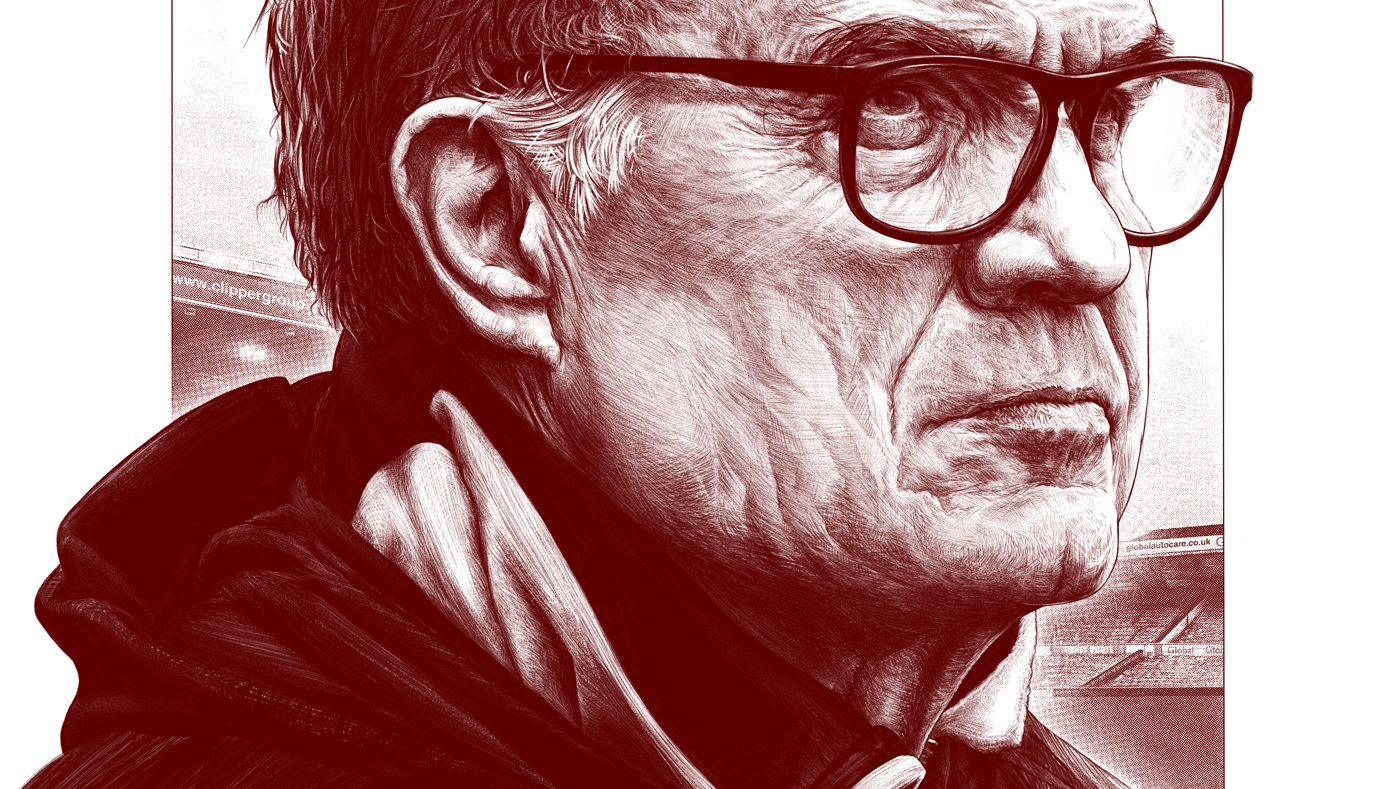
Colouring finished black and white art is slightly different to painting from scratch, and a lot easier. A step-by-step walkthrough using the Bielsa portrait — from clean PNGs and multiply blending to colour correction and texture.
Field Notes
An editorial record of process, decision-making, and image construction from the studio archive.
Open related dossier →(WIP)
Colouring finished art is slightly different, and a lot easier.
There's a few shortcuts available here thanks to having final line art.
Other process walkthroughs here and here.
Setup:
Tablet: iPad Pro 12.9" 2022
App: Procreate & Adobe Photoshop
Resolution: 6000 x 9000 pixels
DPI: 600
Colour profile: Image P3
Swatches: For Procreate
Link
I normally wouldn't bother telling you explicitly what colours to use for painting faces, since every style and every face is different. But if it's helpful here's the swatch palette I used. Porcelain isn't technically an appropriate palette for Marcelo, but it's what I used.
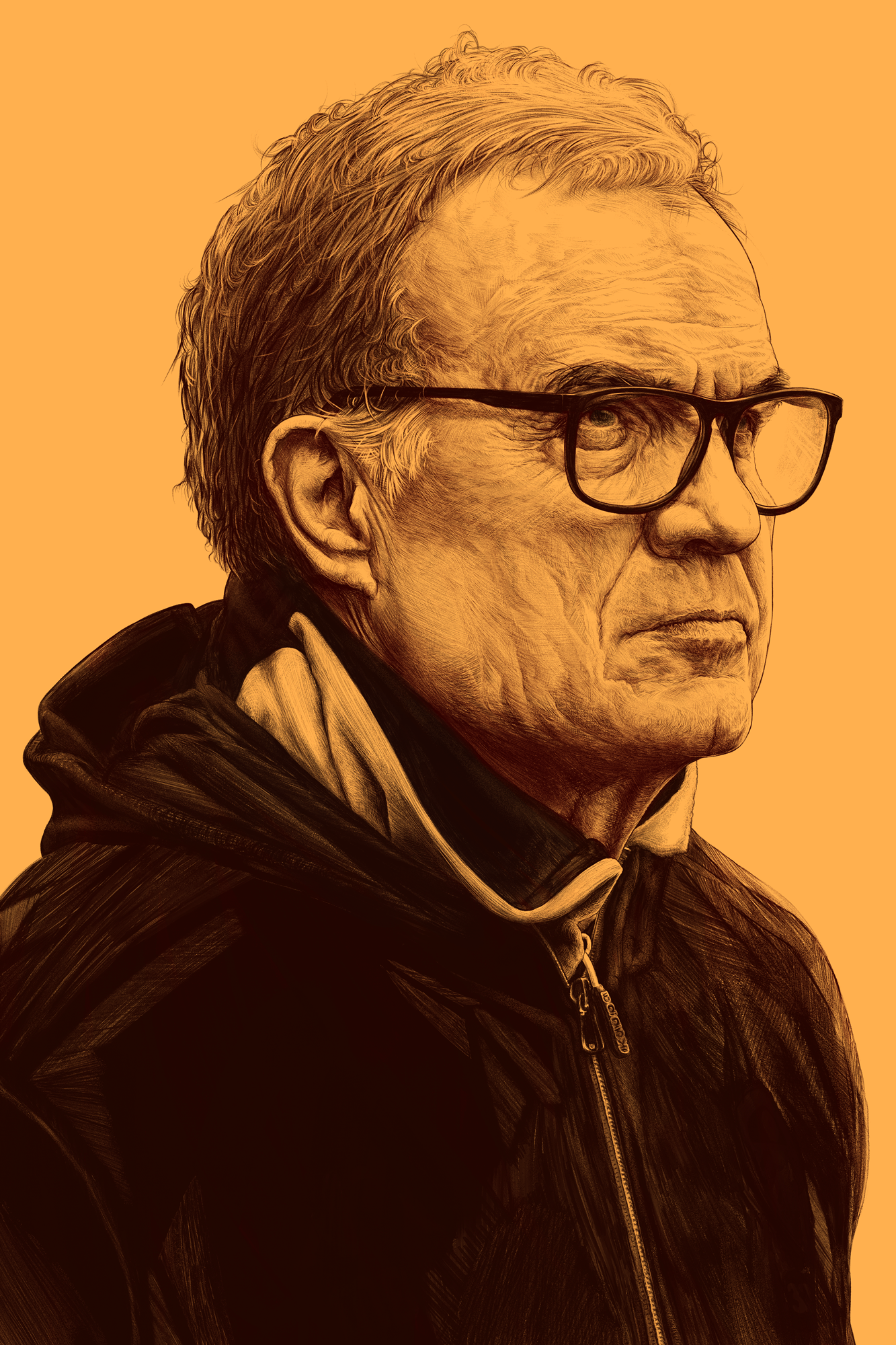
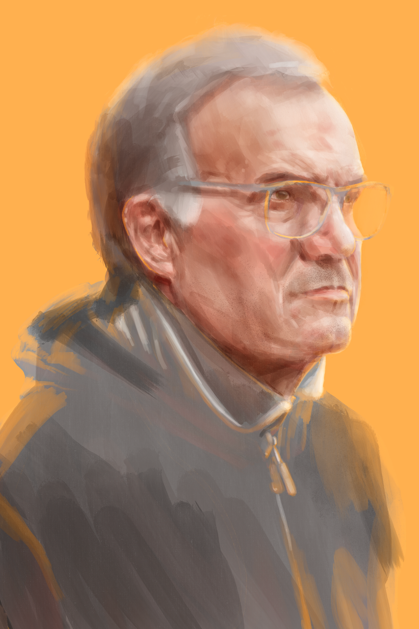
Step 1: Finish a Drawing
Yep. This walkthrough is solely for colouring finished art.
If you'd like to know how I colour portraits as I'm making them, read this walkthrough instead.
A coloured Bielsa portrait.

You can do all sorts with it! All sorts.
Like make the background black and add a moon.
Crazy stuff.
Step 2: ✂
Remove any elements from the drawing you don't wish to colour.
In this case I removed the typography and all background elements.
Bielsa sans BG.
Step 2.5: PNGs
If your art can't be chopped up you desperately need this step.
It's also useful if your artwork isn't clean enough when simply turning off the BG. Mostly what we're doing here is simplifying the next stages and giving you a bit more freedom going foward, but it's not essential. Turn off the BG fill layer and you'll notice your art (maybe) has a bunch of white from where you (might've) softened some of the blacks. By itself this is good enough, since future adjustments will be hitting only the blacks, thanks to using multiply as a layer mode. But we can pretty easily remove all the white, so there's little reason not to. It also means we aren't limited to using multiply as the later steps would otherwise necessitate.
Make the image Grayscale. Image > Mode > Grayscale. Don't merge the layers, and discard all unnecessary layers.
Select the entire canvas with Ctrl - A, and copy it. Ctrl - C if you're lazy.
Go to the Channels panel, by the Layers panel.
Create a New Channel by clicking the menu at the bottom. This is a new alpha channel using only the black and white channels.
Paste (Ctrl - V if you're still being lazy) your artwork to this new alpha layer.
Click Load Channel as Selection from the bottom menu.
Your art will now be loaded, as a selection no less. Given this is an alpha channel layer we'll only see the white parts of your art. Invert the selection (Ctrl - Shft - I). Now we've selected the inverse of the white, the blacks (where the black parts previously occupied, technically there's no fill, yet).
Select your main Gray channel.
Create a New Layer.
Use the Paint Bucket Tool to fill the selection with black.
Deselect the art.
Turn off the main artwork layer, and the background layer.
Convert the art back to RGB, from Grayscale.
You now have your solely black artwork, ready for all sorts of PNG manipulation. Free from just using the multiply blend mode.
Simply turning off the BG Fill.
A Clean PNG

Step: 2.75
This isn't necessary either, but making the black line art a warmer tone, such as red, helps make things more natural. Less colour tweaking at a later point.
A warm Bielsa.
Step 3: Multiply
Here, clean PNG or not, we use the multiply layer mode.
The beginning.
Step 4: Base Colours
Paint underneath the line art, you'll quickly get a feel for how the line art is responding the painting you're laying underneath. Thanks to the multiply layer mode the line art is blending nicely with whatever skin tones you're painting in, especially if you tweaked the line art to a warmer hue.
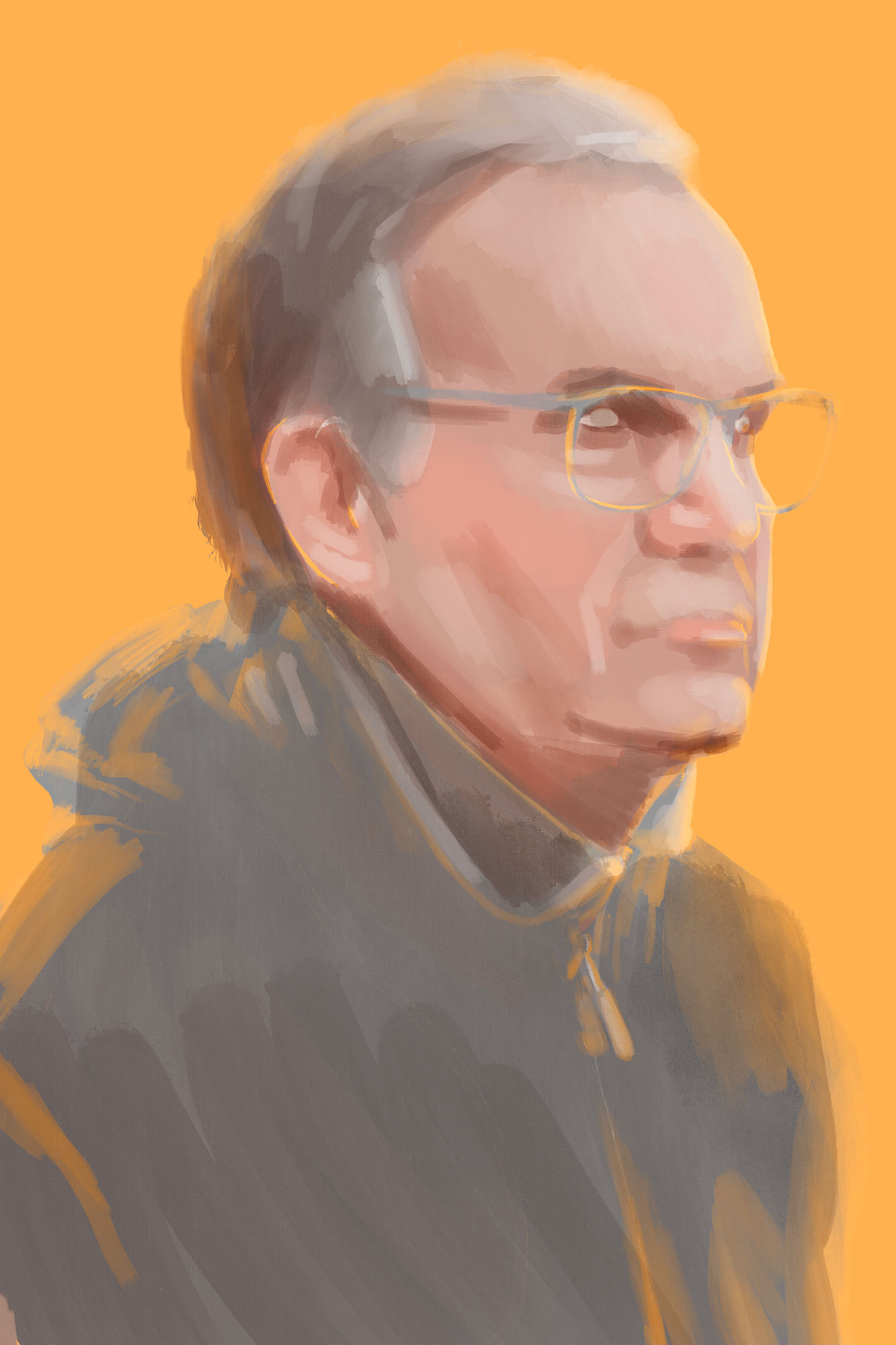
Isolated underpainting
Step 5: Paint on top
Using clipping masks, paint straight on top of the line art layer. Use soft light, overlay, and low opacity normal layer modes to continue buliding your portrait. Line art has a tendency to be a more absolute representation of shading, tone etc. So smoothing out some of the line art helps to produce a more natural final colour potrait. You can even use layer masks to outright remove parts of the line art you feel are no longer necessary.
Isolated top painting.

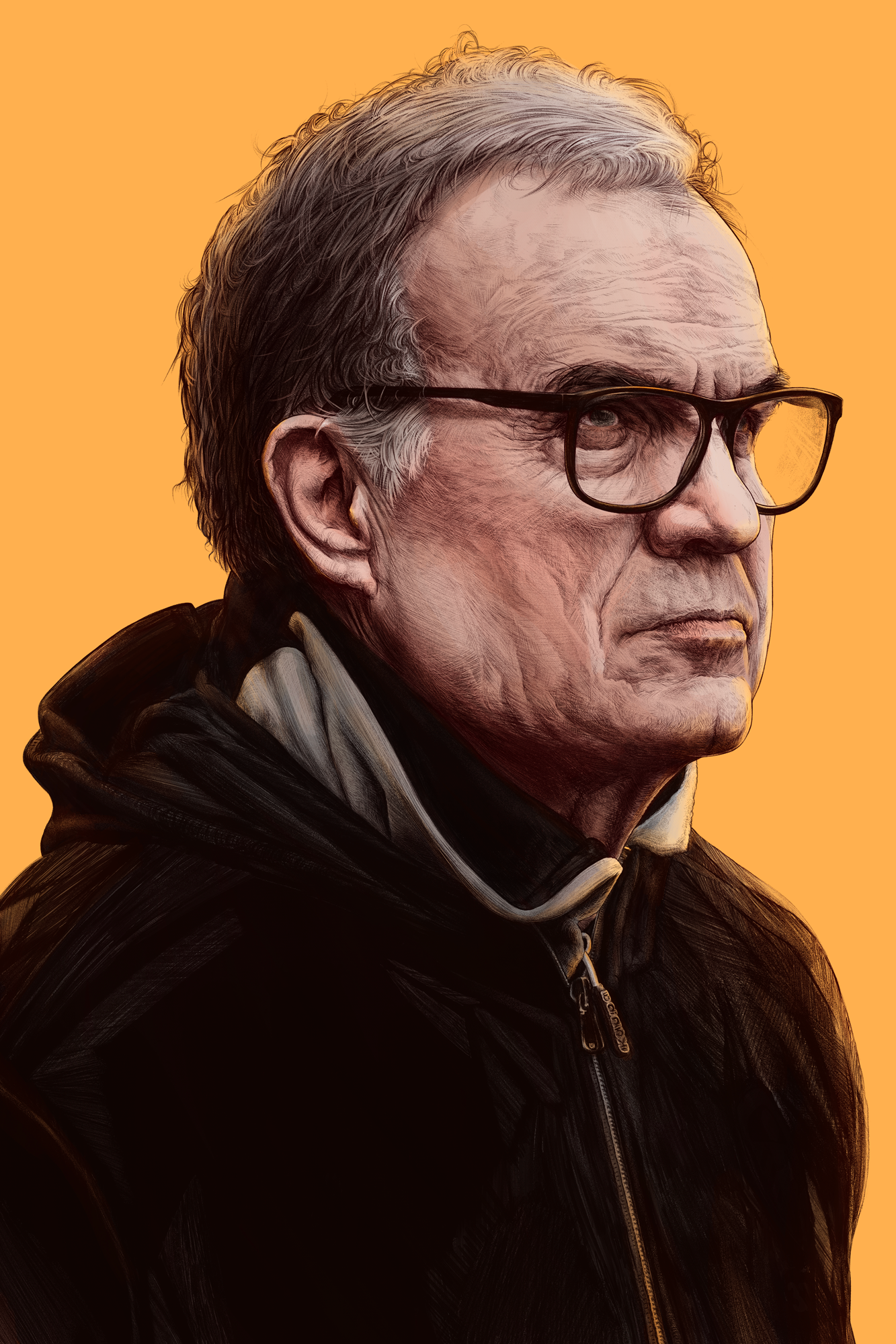
Step 6: Colour and Texture
I technically paid for the texture I'm using here, so it wouldn't be right sharing it with you. But it's from Max Packs. The Hot Press paper at 100% multiply. Well worth buying this pack if you use Procreate.
Final colour adjustments and textures.
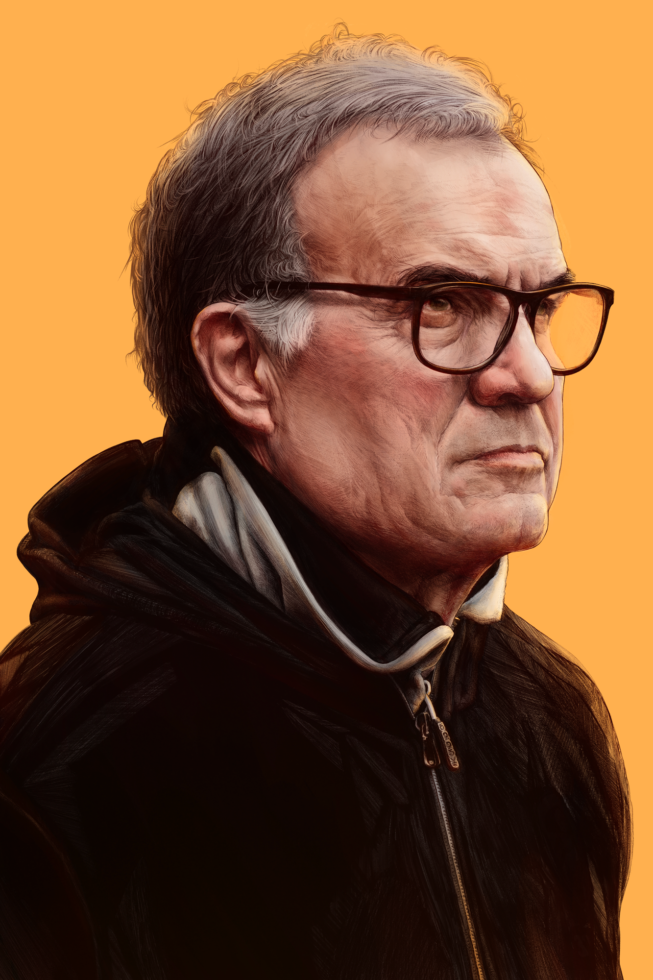
Flattened the whites.
